
ID=114
The top content panel displays courses that are marked as "top content" in the catalogue.
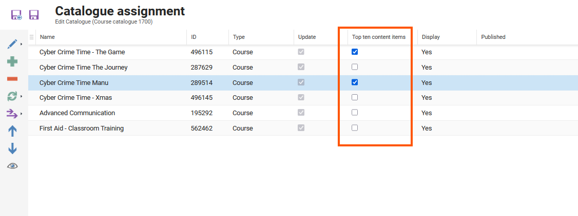
In the assignment area of contents to a catalogue a column is displayed calles “Top ten content items”. All contents marked here are shown in the “Top centents” panel.
Panel Settings
Number of Shown Contents
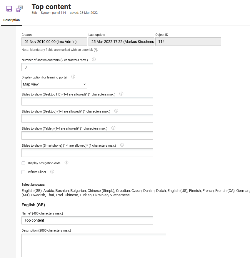
This option limits the amount of content displayed in the panel. If additional content is available, a link to all content (e.g. all current courses) is displayed. If the field is empty, all available content is displayed.
The Carousel view provides additional configurations for the panel contents to display different views in the Learning Portal.
Based on the screen types, up to 4 tiles can be configured for the content to be displayed in the Learning Portal, with a maximum of 1 character in each section. There are 4 screen types: Desktop HD, Desktop, Tablet, Smartphone.
Moreover, the Carousel view provides 2 additional options that can be selected based on the preferred content view: Display navigation dots and Infinite slider.
For learning paths, this option is only available when content-driven paths are used in the panel. For level-based learning paths, a single type of display is supported; therefore, this setting is shown as disabled.
|
Setting |
What does this Setting do? |
|---|---|
|
Display option for learning portal |
Panel contents can be displayed in different views in the Learning Portal. There are several options available for this. Either the map view or list view can be used. Alternatively, there is the option to display a slider with either one or multiple tiles in focus, while other tiles can be controlled using buttons or swiping on a touchscreen. |
|
Slides to show (1-4 are allowed) (1 characters max.) |
Defines how many slides are shown per breakpoint, Desktop HD, Desktop, Tablet, and Smartphone, when Carousel view is used. Between 1 and 4 slides are allowed per breakpoint, and a value is required for each of the four fields. |
|
Display navigation dots |
Allows the display of the navigation dots below the panel when the carousel layout type is used. |
|
Infinite slider |
Displays an arrow-based navigation at the top of the carousel. The navigation will be continuous, starting again from the beginning when reaching the end of the list. |
Related Functions