
ID=187
This panel enables the display of a slider featuring images and videos, with the functionality of overlaying text directly onto each image or video.
Panel Settings
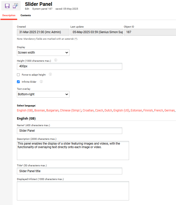
Display
Two options are available for displaying the slider in the learner front-end:
Screen width: The slider content will cover the whole screen width
Content width: The slider content will have the size of the content uploaded
Height
The image or container is kept at a specific height, regardless of the content inside. The size does not change automatically. The image retains its original shape, but it might be cropped or have extra space if it does not fit exactly.
Force to adaptive height
This option takes the height of the image or container and automatically adjusts it to fit its content. If a specific height is configured, it will ignore it. It also keeps the image's original shape and proportions, so nothing gets stretched or squished.
Infinite Slider
It displays arrow-based navigation at the top of the carousel. The navigation is continuous, starting again from the beginning when the end of the list is reached.
Text overlay
When text is entered, its position can be configured for the content (image or video).
Bottom left: Text is positioned in the bottom left of the slider.
Centered: Text is positioned in the center left of the slider.
Bottom right: Text is positioned in the bottom right of the slider.

Contents
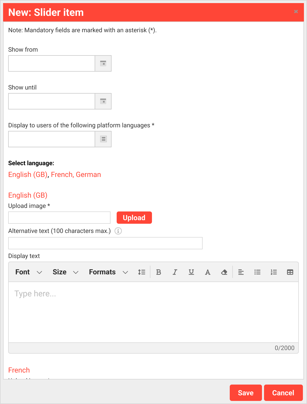
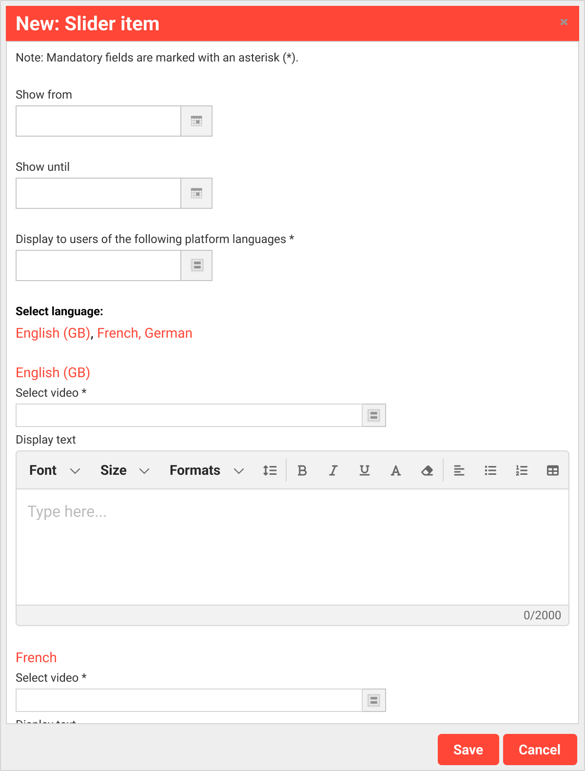
In the contents tab, two items can be selected and configured for presentation in the slider.
-
Image
-
Video
The configuration for each item adheres to the same structure:
Show from
This setting establishes the date on which the item is displayed in the slider.
Show until
This setting establishes the date until which the item is displayed in the slider.
Display text
Text can be added to the image. This text appears based on the “Display text position" found in the description tab.
Hints & Tips
A button can be displayed as a Call to Action on the slider within the text box.
The “source” tab in the text-rich editor can be used to add the following CSS tag and exchange the URL and the button text. The “...” must remain available after the exchange.
<a class="ImcButton" href="https://www.google.com" target="_blank">Button test</a>
Related Functions