
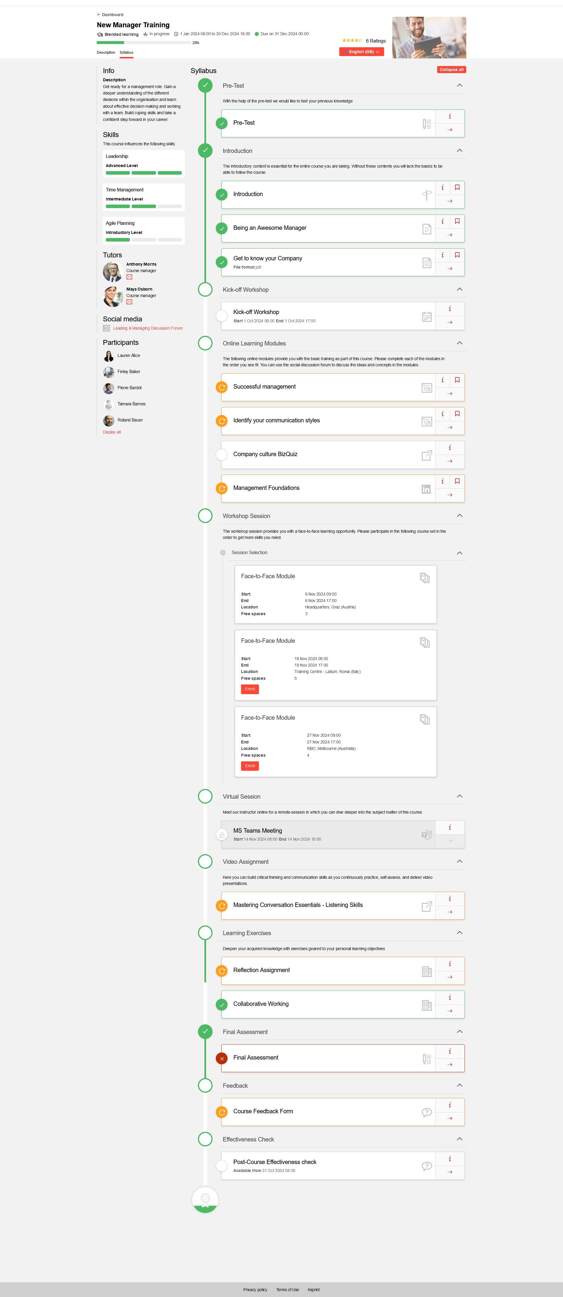
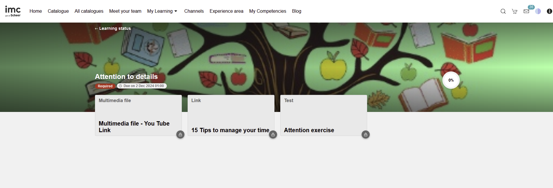
Course room types are used to define the appearance of the courses for the learners. The course room is divided into columns with panels that can be switched to visible or not visible in the course room type. The names and content of the individual panels can also be defined in the editing process.
The first two columns of the course room have double the width of the last column. This is why it is not possible to move all panels of the third column panels into another column. Panels in columns one and two can be arranged and exchanged as desired. Learners cannot change the order of the panels in the course room.
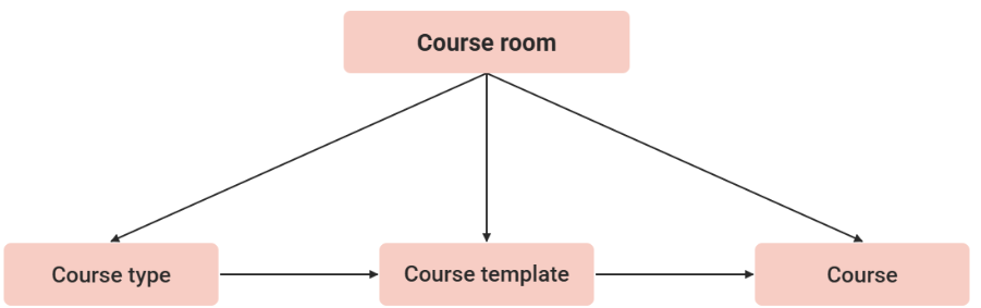
Active course room types can be directly assigned course types, templates, or courses and thus give the course its appearance and the information displayed. Already assigned inactive course room types remain valid for the appearance and information on courses but can no longer be assigned.
Functions in the Management of Course Room Types
New
Columns and Panels
Pre-defined panels are available in course room types. The display in the course room can be defined for these panels by selecting the checkbox. The order of the panels in the columns can be modified via drag and drop, cutting and inserting, or the arrows. The only panel that can be duplicated is the syllabus panel. The name of the panel can be freely defined during the editing process.
The following panels are available in the course room:
Info:
All meta tags and attributes that are set to visible for the course room via the course type or course template are displayed in this panel. An option is also available in the panel to restrict the selection and sorting of meta tags and attributes. Only visible meta tags and attributes that have also been added to the panel are then displayed in the course room. By duplicating the info panel, user-defined panels for displaying selected information can also be created.
Panel specific settings:
-
Use course-specific settings for the display: If this option is selected, only the settings on the "Meta tags and attributes" register or the course template or course type are taken into account. Contents to be displayed in the panel must be added there and the display in the course room needs to be activated.
-
Use panel-specific settings for the display: If this option is selected, the settings on the register "Meta tags and attributes" of the panel are also taken into account. Only content that is added there as well, will be displayed in the panel. The arrangement of the contents will be made as defined on the register "Meta tags and attributes" of the panel.
-
Hide names of meta tags and attributes: The names of meta tags and attributes are displayed as headings in the panel. By activating this option, they can be hidden. This makes sense, for example, if only a single meta tag shall be displayed in an info panel.
-
News:
News assigned to the course is displayed.
Tutors:
The tutors assigned to the course are displayed. If the panel is edited, additional panel characteristics can be defined via the "Display options" tab. For example, displaying a profile image or the online/offline status can be modified. When the "Show email icon" is enabled, the learner has the possibility to contact the tutor from the panel. This can either be done via an external mail client or, if the additional setting for using internal messages is enabled, the learner can send a message directly from the LMS.
Panel-specific layout options:
-
Show profile image
-
Show “e-mail” icon
-
Send e-mail using internal messages: Allows to define whether the mail function available to the learner on the tutor panel has as effect opening the external email client (when the checkbox in disabled) or opening a form where the learner can compose a message which is visible to the tutor in the internal messages of the system (when the checkbox is enabled)
Syllabus:
All syllabus components are listed. There is the option to depict very simple but also more complex scenarios with different configurations. Thus, for example, a setting can be applied such that, when opening the course room, the next component to be edited is automatically opened. If a lot of content is integrated into the syllabus, a detailed view of the syllabus can be opened, providing even more space for information. The syllabus panel can be duplicated. Depending on the course configuration, learners can mark components as completed. In the course room, there is a clear separation between the components already completed by the learner and those not yet processed through the use of two syllabus panels. The configuration for this also takes place via the "Display options" tab.
Panel-specific layout options:
-
Show incompleted components: Depending on the setting of the metatag "Learners can mark content as completed themselves" in the course, the panel will show components which the learner has not yet marked as completed himself. The status is automatically set for components which have their own logic, tests for example.
-
Display completed components: Depending on the setting of the metatag "learners can mark content as completed" in the course, panels can be shown in the panel which the learner himself has marked as completed. The status is automatically set for components which have their own logic, tests in the syllabus for example.
-
Show locked components: Components may not be available at the moment to learners, for example due to logistics or scheduling. However, these components will still be shown if the checkbox is ticked.
-
Show only one component per line: When using the one or two column layout, up to three components per line can be displayed. However, with this setting, only one component per line is displayed. This setting is only taken into account in the Learning Portal.
-
Display important information on medie tiles
-
Hide time zone information on the tiles: If activated, no time zone information is displayed on the tiles, even if they are configured for media or courses.
-
Show vertical folder progrress
-
Display the sub-courses based on a defined order
-
Default
-
Start date ascending
-
Start date descending
This setting will define the order of the sub-courses. The default option will be preselected and will display the order of the sub-courses defined in the Course manager. Start date ascending option will display the sub-courses based on the start date from the earliest one first to the oldest one. The start date descending will display the sub-courses based on the oldest start date first to the earliest one
-
Open the fist folder with educational contents not completed: This setting determines how the course syllabus folders are displayed when a user enters the course room: The first folder with incomplete learning content is opened and the other folders closed.
-
Open all folders and subfolders: This setting determines how the course syllabus folders are displayed when a user enters the course room: All folders and sub-folders are opened.
-
Close all folders and subfolders: This setting determines how the course syllabus folders are displayed when a user enters the course room: All folders and sub-folders are closed.
Library and Social Media:
As with the syllabus configuration, the display can also be configured in the library and social media panel. Fewer functions are available compared with the syllabus panel.
Panel-specific layout options:
-
Show only one component per line: When using the one or two column layout, up to three components per line can be displayed. However, with this setting, only one component per line is displayed. This setting is only taken into account in the Learning Portal.
-
Display important information on media tiles
Progress:
The course progress is shown in this panel. In addition to displaying a progress bar, the numbers of completed, in-progress, not-passed, and not-started components are displayed. As the function is client-specific, this option must also be activated in the client settings. The progress bar is displayed for courses and learning paths in split-screen and portal-page panels. No progress chart is displayed in the catalogue, course → Syllabus, or wishlist. The component status is visible when the mouse is moved over the progress bar. The progress of learning paths is calculated only via the status of the assigned courses; the course component status is not included. The result is calculated from the ratio of booked and completed courses. Courses not yet booked are not included. Folders are also never included when calculating the progress of courses and learning paths. The assessment is displayed, depending on the configuration in the course room, in split screens and portal-page panels. The progress panel can also be output in the first or second column.
Rating:
In the course context, various aspects can be completed using a five-star grade. It is used to provide information about quality to learners, administrators, or tutors. The number of assessed criteria can be configured on the "Display options" tab. If other factors are to be assessed, the wording of the bundle in the system texts can be replaced. The overall assessment is provided by the aggregated values of all sub-grades and cannot be analysed. The assessment panel can also be output in the first or second column. The rating is only available for courses, learning paths, and tests for which the "Permit rating" meta tag and the course room panel have been activated. For tests, the "Rating" checkbox on the "Display options" tab must be activated. The assessment is displayed in the course room, in split screens and portal page panels, and enables an object to be assessed in the learner's view.
On the tab “Layout options” it can be configured what can be rated by activating the checkboxes.:
-
Dispaly tutor’s rating
-
Display comprehensibility of the content
-
Display dificulty of the content
-
Dispaly the scope of the content
-
Display structure of the conetent
Calendar:
All deadlines generated by the platform are visible in a calendar. In addition to deadlines for courses, it is also possible to create and display private deadlines here (depending on the configuration).
Only the following content types are displayed, if scheduled (need to have start date):
-
Event
-
Adobe Connect Meeting
-
Open Meeting
-
GoTo Meeting
-
GoTo Webinar
-
Feedback form
Only elements from the syllabus are considered. It is not possible to add personal scheduling. Appointments are not displayed as a calendar control, but as a list of appointments.
Participants:
There is an option to display all course participants in a panel. As there may be many participants, the number of learners displayed can be restricted through the configuration. If more learners have booked the course than can be displayed in the panel, learners who are online are always displayed first. The display of the profile image and online/offline status can also be configured. The learners are then displayed in alphabetical order.
Panel-specific layout options
-
Show profile image
-
Number of participants shown in the panel: The length of a panel is always based on the amount of content contained therein. This number value determines how many entries are shown in the panel. The length of the panel can thus be restricted to a maximum.
The information to be displayed can be configured via the user list with ID 72.
-
Skills:
The course skills can be output in a separate panel. A scale with target values is displayed. -
Organiser:
If an image has been uploaded with the "Organiser" metatag it is displayed in the panel. -
Resources:
The booked course resources are displayed.
Duplicate
Edit
Edit → Enable/Disable
Course room types can be enabled and disabled. Deactivated course room types are not displayed when assigned to course types, templates, or courses.
Edit → Configurable Layout/Syllabus only
Course room types can be configured according to preferences. A configurable layout can be defined using the multiple options in the Columns and Panels tab. Options such as Rating, Tutors, Skills, and Info can be enabled or disabled in the course room. The Syllabus only option offers a simplified course room containing only syllabus items.
Edit → Position of Media Content Navigation
The position of media content navigation in the syllabus content is determined here. If the "Top" option is selected, the bar is displayed at the top, making it possible for learners to navigate to the next or previous component and return to the syllabus content. If the "Bottom" option is selected, the bar is displayed at the bottom of the selected component. If the "No navigation" option is selected, the view of the media content navigation is simplified to contain only the possibility of returning to the syllabus content. Therefore, with this option configured, there is no navigation to the next or previous component.
Important! This option is relevant when there is a high number of components within the syllabus content, making navigation more efficient.
Delete
Clearances
Global Functions and Related Topics
Course Template Administration
How-to-Guides
https://doc-en.scheer-imc.com/FAQsAndTroubleshootings/course-room-design