In addition to the highlights presented, there are many other innovations and improvements to discover in the product core. The following core updates are listed by their category:
Course Management
Display Identification Code in Prerequisite pop-up
Overview: The enrolment prerequisite pop-up window has been updated to include the course identification code. Previously only the title was shown of the courses required by prerequisite rules. This could make it difficult for users to quickly identify and reference the specific courses needed. This is specifically designed for courses that share the same or similar names, to easily distinguish via the Identification Code.
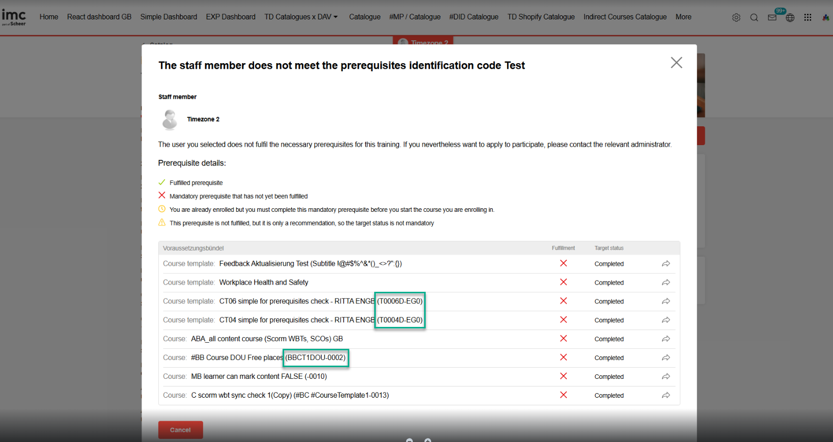
Benefits and Use Cases: Displaying specific course codes in addition to course titles in all relevant messages and views related to prerequisite courses enhances the user experience. The update provides users with a clear reference to improve the efficiency of the enrolment process in identifying exact requirements. The absence of course codes in the pop-up window caused inconvenience, as users had to search for the missing prerequisites by their titles alone. This could be cumbersome and time-consuming, especially for course titles that are similar or lengthy.
Audience: Learners and Supervisors
Setup & Access: Requires the Identification Code workflow to be active in the Configuration function Identification code menu by ticking the Active checkbox. The Course/Course template must also have the Identification code setting enabled which is first done in the Course type via the Process complexity tab.
Considerations & Limitations: Standard update with no migration required.
Testing: Ensure Identification codes are active in the system ‘Configuration’ and also for the Course type. Create a course template with an identification code pattern, and then create a course from the course template. In a separate course configure prerequisites with a required condition based on the new course and assign to a catalogue. When attempting a self-enrolment to the course in the catalogue the prerequisite pop-up will appear that includes the identification code.
Risk rating: Low
Content Management
SCORM Synchronisation Update
Overview: A new meta tag workflow controls whether the status of a WBT (SCORM) media component in a course is automatically synchronised with the system wide status for the user. This update provides further flexibility to an earlier SCORM synchronisation workflow that used a cron job (now removed). If the meta tag is used for a SCORM WBT in a course, then:
-
one-time synchronisation takes place when the user starts the course
-
Status changes from Enrolled to In progress.
-
-
after course start the user can manually trigger an update of the synchronisation via a corresponding button in the course room any time.
Benefits and Use Cases: Improved user experience as learners are no longer required to individually open each SCORM WBT to synchronise statuses. The meta tag introduction additionally provides flexibility on which SCORM items are to synchronise.
Audience: Learners
Setup & Access: Configured via the Synchronise SCORM WBT Status meta tag (ID 11871) on the WBT (SCORM) media type. If the meta tag is already present in the WBT (SCORM) media item then no migration is required.
Considerations & Limitations: This functionality cannot be manually triggered for simplified course room. It’s not possible to add the new meta tag to existing WBT (SCORM) media objects via configuration.
Testing: Edit the WBT (SCORM) media type to add the new Synchronise SCORM WBT Status meta tag (ID 11871). Create a SCORM item from the updated media type with the new setting active. Assign the SCORM media directly to the catalogue and also to a course. Complete the SCORM directly in the catalogue, then enrol to the course that also contains the SCORM. The SCORM will be marked as complete in the course.
Risk rating: Medium
Reporting
Test result for Learners additional info
Overview: A new Results column has been introduced in the Test results (learner) reports to display the learner’s achieved score as a percentage.
_report.png?cb=0c903cd6f20a9d11945abf3efec0e22a)
Benefits and Use Cases: Learners will have additional info on the report regarding their performance of a test for a better overview, not just the Passed or Failed status.
Audience: Learners
Setup & Access: Not required
Considerations & Limitations: The existing functionality to reorder columns in the result is available in the backend. In the frontend there is no ordering over configuration possible by the learner.
Testing: Requires the Test results (learner) panel to be added to a dashboard page and the logged in learner to have completed a test. When opening the report the new column Result column will be displayed.
Risk rating: Low
Dashboard Management
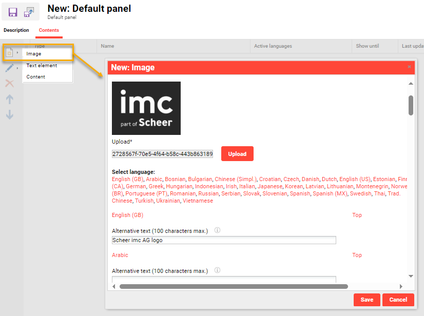
Screen Reader Accessibility for Default panel images
Overview: A text field Alternative text has been added in default panels when creating an image in the Contents tab. These text fields are used to describe the image for visually impaired users using screen readers, or for when the image is unable to load.
Benefits and Use Cases: Visually impaired users relying on screen readers can now access descriptive alternative text for any image displayed on the default panel. This ensures that screen readers can narrate the content or context of images effectively to improve accessibility.
Audience: Learners (visually impaired)
Setup & Access: The Alternative text field is automatically added to image elements and will be available for each activate platform language. Each required language must be populated separately.
Considerations & Limitations: Up to 100 characters. Only for Default panel images.
Testing: Can be done by either creating a new default panel or editing an existing default panel that has an image element. In the contents tab, create or edit an image element, populate the Alternative text fields, and click Save. Assign the default panel to a dashboard, view the dashboard as a learner, and inspect the image.
Risk rating: Low
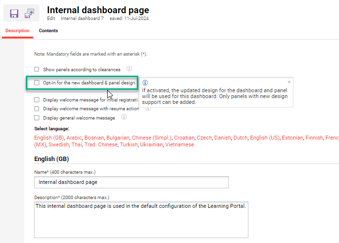
Dashboard and Panels Reimplementation - Angular to React
Overview: Use panels with new designs on learner dashboards as Scheer IMC reimplements many Angular-based panels to React. This transition to React improves design possibilities and security. Panels reimplemented with React (Angular still available) include Current Courses, Recommended Learning, Mandatory Courses, Top Contents, and the Bookshelf panel.

Benefits and Use Cases: The update does not introduce any new features within panels. The initial benefit is alignment with current technological standards and use of a new design.
Audience: Learners
Setup & Access: Panels will not update automatically and re-configuration required. Utilising the reimplemented panels with the React designs will require Opt-in via the Internal Dashboard page function by editing a dashboard and ticking the Opt-in for the new dashboard & panel design checkbox.
Considerations & Limitations: New React and old Angular panel designs can not be used in the same dashboard. Welcome messages are currently not supported for Dashboards with React enabled.
Testing: As a system administrator edit the internal dashboard to activate the new 'Opt-in for the new dashboard & panel design' checkbox and Save. Then login as a learner and check the panels mentioned above.
Risk rating: High
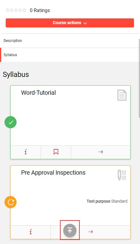
Scroll-up arrow on mobile devices
Overview: A new arrow for scrolling up has been introduced in the learner view for use on mobile devices. The arrow will appear when the learner is scrolling and remain present for three seconds. When clicked the scroll-up will return the learner to the top of the current page with a single click.
Benefits and Use Cases: While using the mobile version of the imc Learning Suite, the learners move around the application and sometimes they want to go directly to the start of the page. This can often require substantial scrolling up which takes time. Benefits include:
-
Reduces time spent scrolling manually, providing a faster, more intuitive way to navigate.
-
Consistent user experience for the learner-facing pages.
-
Mobile optimisation only appears on mobile devices with touch screens and a resolution of less than 1024 in the width, ensuring a distraction-free experience on non-touch devices.
Audience: Learners
Setup & Access: Not required
Considerations & Limitations: Backend (LMS) scroll is not supported due to non-responsiveness and no scroll control in iframe grids. This function is implemented exclusively for touch screens and will only be displayed when the device's screen resolution falls within the tablet range or smaller. This approach ensures that the button is not shown on laptops that have touch screen capabilities.
Testing: Access the LMS using a mobile device and open a long page such as a dashboard or course syllabus. When scrolling down or up the new scroll-up arrow will appear.
Risk rating: Low
Notification Engine
Escalation mails course object specific
Overview: This update enables administrators to configure escalation messages that are course object specific when the due date trigger intervals are reached. Traditionally escalation messages could only include a training block variable that meant details of multiple courses or learning paths with approaching or overdue due dates could be included in the one message.
Benefits and Use Cases: Course specific escalation messages allow for more precise and relevant communication, ensuring that targeted reminders are received for each overdue course. This approach improves user engagement and gives clear information which course has reached it's due date.
Audience: Learners and Supervisors
Setup & Access: In the Notifications function edit the Standard reminder notification (Registration status information > Reminder e-mails > Standard reminder). In the Condition tab a new Send notification per course checkbox has been added. This is unticked by default and ticking will enable object specific messages. Ticking the checkbox will ignore the $traininglist_block_start$ to $traininglist_block_end$ placeholders in the escalation message.
Considerations & Limitations: The default value of the Send notification per course setting is unticked.
Testing: Testing requires the new Send notification per course checkbox to be ticked in the Standard reminder notification, the notification to be active, and the trigger conditions to be met with a user not completing mandatory training by the due date interval.
Risk rating: High
iCal Cancellation notification for Event Component
Overview: A new iCal notification for event components alerts course tutors of the event cancellation if the course is cancelled. Prior to the update a cancellation notification would be sent and the iCal meeting for the course would be deleted, but the event iCal would remain.
Benefits and Use Cases: Avoids confusion by deleting the iCal appointment for the event and not just the course.
Audience: Tutors
Setup & Access: Not required
Considerations & Limitations: Migration not required
Testing: Testing requires the creation of a date-dependent course that has a tutor assigned to receive appointments. In the Components tab create an Event media with the checkbox ‘Create appointment in the tutors’ calendar' ticked. On saving the course the Tutor would receive two separate iCal appointments. When cancelling the course, both iCals appointments would be cancelled.
Risk rating: Low
Organisation Management
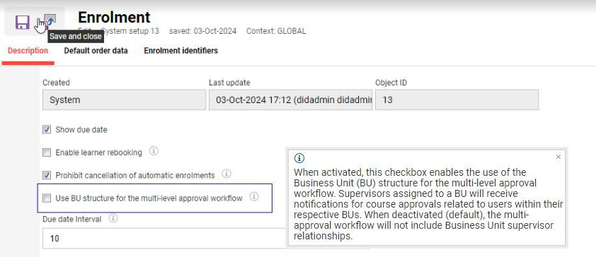
BU Structure Checkbox for Multi-Level Approval Workflow Visibility
Overview: A new configuration checkbox provides control over visibility of employee information in multi-level approval workflows. When activated, the Business Unit (BU) structure is enabled for the multi-level approval workflow and BU supervisors can view their staff requests via the Booking request panel. Supervisors assigned to a BU will receive notifications for course approvals related to users within their respective BUs. When deactivated (default), the multi-approval workflow will not include Business Unit supervisor relationships.
Benefits and Use Cases: The new configuration ensures that supervisors see only employees directly assigned to them, reducing complexity and enhancing data relevance for managers by removing visibility into business units (BUs) not directly related to them. This is beneficial in scenarios where managers should only see employees they manage directly as indicated in the user profiles.
Audience: Supervisors
Setup & Access: In the Configuration function edit the Enrolment menu. In the Description tab tick the new Use BU structure for the multi-level approval workflow checkbox. The default state of the checkbox will be inactive to retain current system behaviour.
Considerations & Limitations: Standard inclusion. No impact to existing customers as the checkbox will be set to inactive by default.
Testing: Edit the Configuration > Enrolment menu to ensure the new Use BU structure for the multi-level approval workflow checkbox is inactive by default. To test the update tick the checkbox and click Save. Testing would require a multi-approval workflow to be created or edited to check if BU supervisors are visible.
Risk rating: Low
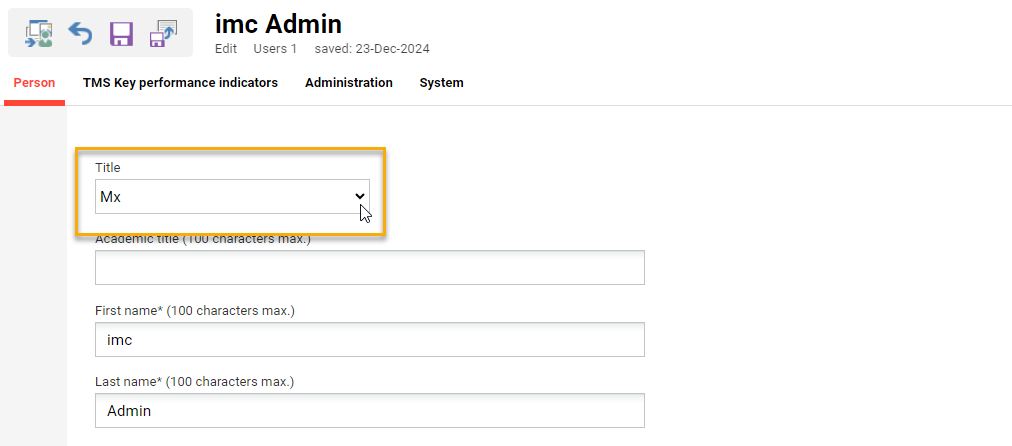
Introduce Mx./Diverse as gender selection
Overview: Following many requests the Gender personal attribute has been updated with a third selection diverse option which is Mx. This sees the associated selection list linked to the Gender attribute updated with a new entry (ID 3) and a new icon introduced.
Benefits and Use Cases: Providing an additional option better describes diverse genders. Allowing the selection of a third gender in a user profile for both title and gender provides several benefits:
-
Inclusivity: It acknowledges and respects the identities of non-binary, genderqueer, and other gender-diverse individuals, fostering a sense of belonging.
-
Representation: By offering this option, platforms reflect the diversity of their users, promoting visibility for underrepresented groups.
-
Personalisation: It allows users to feel accurately represented in their profiles, which can enhance their experience and connection with the platform.
-
Social Progress: Demonstrates a commitment to progressive values and equality, enhancing the platform's reputation.
-
Improved Data Accuracy: Provides a more realistic representation of user demographics, which can be valuable for analysis, reporting, or tailoring services.
Audience: Learners
Setup & Access: No configuration required as the new option is automatically added to standard “Gender” (SEX) personal attribute selection list. For user data interfaces where source systems provide the gender the ID for the new Diverse/Mx select option is 3.
Considerations & Limitations: Standard update and no migration required. Will not impact existing user data interfaces that could update the personal attribute as a new ID is used.
Testing: Edit a user via a profile that has the Gender attribute assigned.
Risk rating: Low